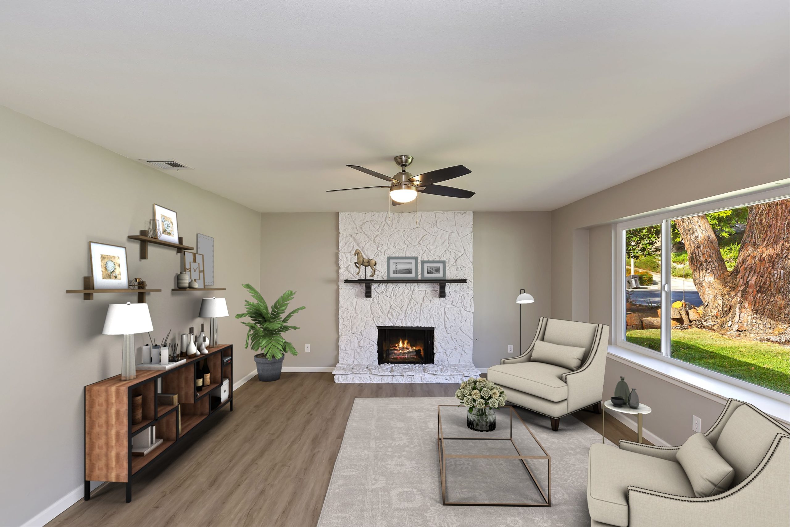
Refresh & Repair: Offercity Rehab Project
Offercity not only specializes in helping families looking to sell their homes but also brings some TLC to homes that need a little refresh and redesign before new families settle in. Our first rehab project is this charming Riverside home; when we first visited the house, we knew it had the potential to be so much more.
To start the process, once the home is vacant, the first thing we commit to doing is removing any unwanted belongings before starting the redesign process. After we cleared out all belongings, we met with our contractor and got our creative juices flowing. This home had a great foundation but had the opportunity to offer more.

We knew we wanted to keep the home’s charm but add a modern feel and look to it from the start. The first thing we tackled in the redesign process was to remove all flooring and carpets from all the rooms. Next, we sanded and repainted every wall to a chic gray color.
The main living room is the first thing you see when you walk in, so we wanted to make a complete makeover of the room. We removed the vertical blinds in the main living room, repainted the fireplace and mantel, and added a ceiling fan with light to brighten up the room.

To open up the space in the kitchen, we eliminated the existing entryway closet connecting to the kitchen, tore down the old kitchen cabinets, and got rid of the double wall ovens. The kitchen lighting was outdated, so we removed the lighting panels giving the kitchen a higher ceiling, and installed recessed lights.
Next, we added white shaker cabinets with matte black handles to give it a fresh new look, along with adding a black single basin sink, stainless steel appliances, and marble quartz countertops. Instantly you can see the difference this updated kitchen made to the central area of the home.

The dining room area has a wall adjacent to the primary bathroom and bedroom. To add more space to both places, we removed the wooden panels and closed off the bookshelf on the dining room side. Next, we pushed out the wall in the primary bathroom to add an oversized shower and more cabinet space. Which ultimately maximizes the area in both the dining room and master bathroom.

The original floor plan had double doors connecting the family room to the master bedroom; however, we completely separated both areas. We closed off the double doors by installing drywall, adding more privacy to the primary bedroom. The home originally came with three bedrooms, but we added drywall in-between to get more out of the space, transitioning one large bedroom into two.

The two bathrooms received a major transformation. The primary bathroom had a very tight space with a tiny vanity and cramped shower and toilet. By pushing out the wall connecting to the dining room, we were able to add a spacious walk-in shower, more standing space, and extend the vanity onto one of the walls. We installed ceramic tile into both bathroom showers, opened a small storage area in the center, and added a marble mosaic to contrast the tile. We added a new vanity in the second bathroom with grey drawers and matte black handles, sink, and lighting fixture to complement the marble quartz and ceramic tile shower.

The final steps to the home’s makeover were adding new flooring, carpet and revamping the front and back yard. We installed greige laminate flooring throughout the house, added premium carpet for a cozy feel in the bedrooms and family room, and installed Canberra decor porcelain tile in both bathrooms. To freshen up the front and backyard, we installed synthetic grass and mulch perfect for those warm days you want to spend outside.

Once we reached 100% completion, we cleaned up the home a bit and brought in our professional photographer to capture every renovation we made.

Request cash offers from real investors in your market. No staging, no fees and no showings required! Contact Offercity